we’ve gone platinum: the next evolution of the leaselabs brand
realpage innovation x leaselabs creativity ushers in a new era
For over 10 years, LeaseLabs® has been a leader in the marketing and multifamily industry. To commemorate this exciting milestone, we’ve gone platinum. This new evolution of the brand pays homage to our culture and history while celebrating our new RealPage partnership and future with a fresh spin on our brand identity, color palette, and logo.
revamping our brand, elevating our abilities
In this new step forward, LeaseLabs will maintain its role as a leader within the industry. As we continue to push creative boundaries and spearhead innovation, we will do so with an elevated identity that represents our evolution as a company. With a new sleek platinum color palette and a contemporary style, we’re ready to reach new heights. We’ve maintained a high standard for success throughout these years, and are eager to continue doing the amazing things we do as we usher in this new era.
—
“We’ve developed our vision over many years through our fantastic products, a unique culture, and an incredible customer community. Today, we’re taking a bold step forward with a new logo for LeaseLabs.”
steven ozbun, president, leaselabs
—
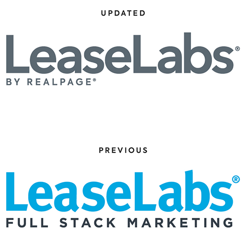
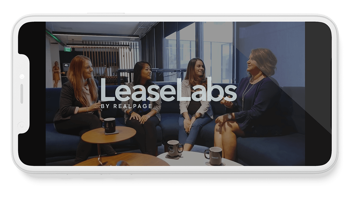
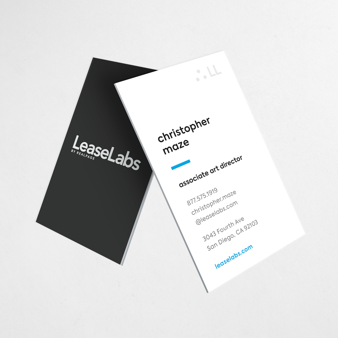
the logo
Friendly, modern, and straightforward. The rounded font, weight, and modern sensibility brings the logo up-to-date with a refreshed look and feel without losing its brand equity.
old versus new
How can one tell the difference between letter forms? By examining the lowercase ‘a’ of two seemingly similar sans serif typefaces one will notices the complexity of each individual letterform. A comparison of how the stems of the letterforms finish and how the bowls meet the stems quickly reveals the difference in character between the two.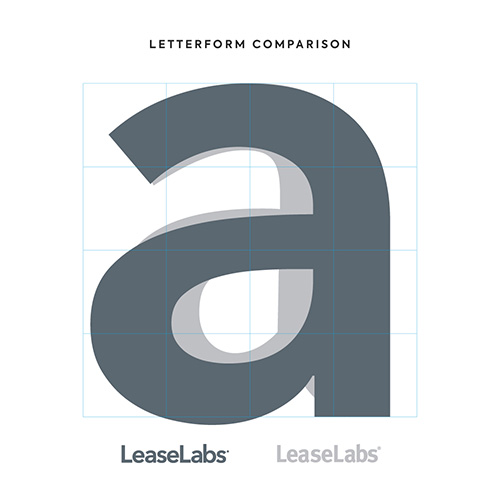
our approach: simplistic yet sleek
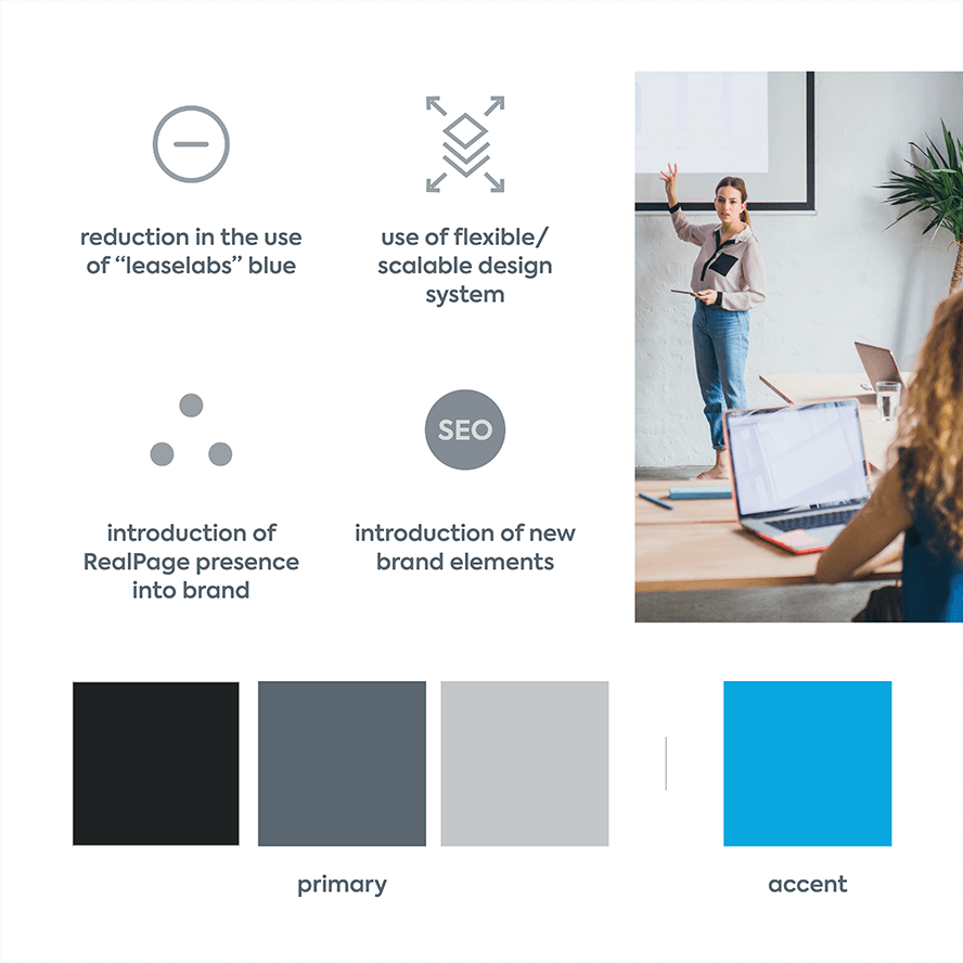
This redesign pays homage to LeaseLabs’ brand equity while introducing a glimpse into the future as part of the RealPage, Inc.® family. It features subtle shifts in the color palette, logo treatments, and brand flexibility.
Our new color palette integrates with RealPage’s secondary platinum color with our own set of medium greys. As a result, we’ve produced a neutral, yet highly flexible set of color tones that allows for more flexibility and opportunities to pair with bold accent colors effortlessly along the way.
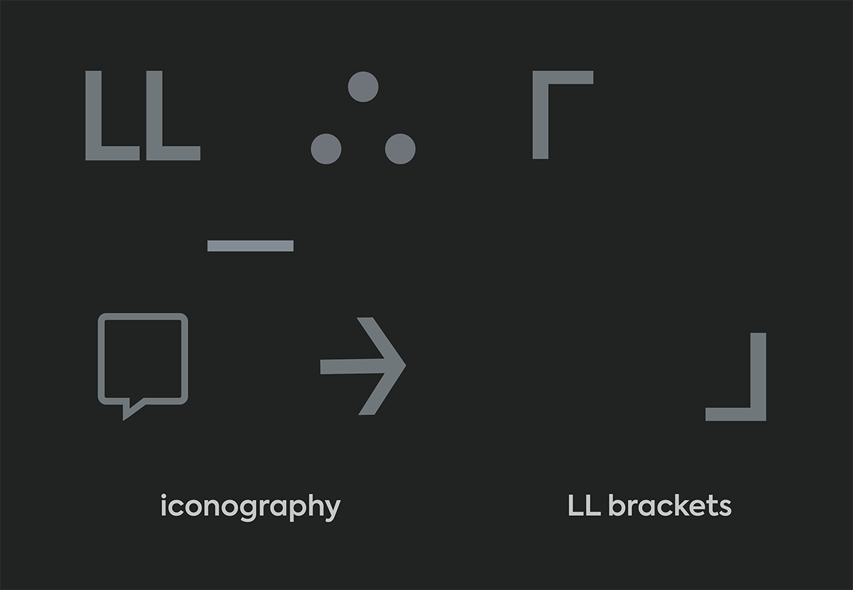
design elements
We’ve deconstructed our original logo to bring to life several design elements. These icons support our overall design strategies and can also be used to indicate a call-to-action.
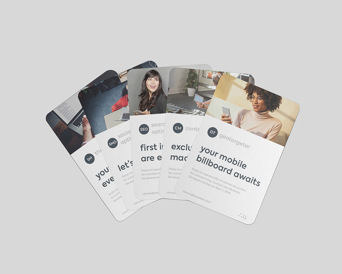
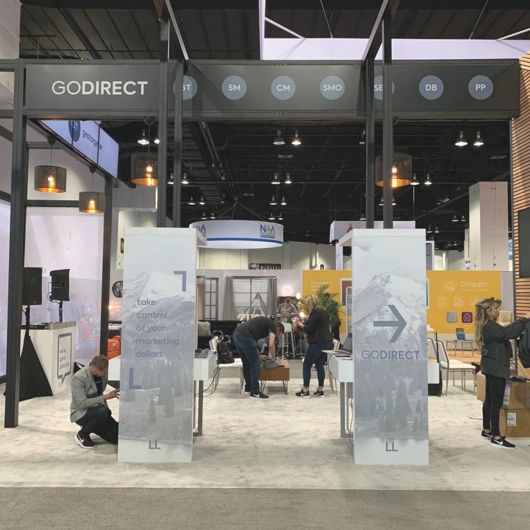
product icons
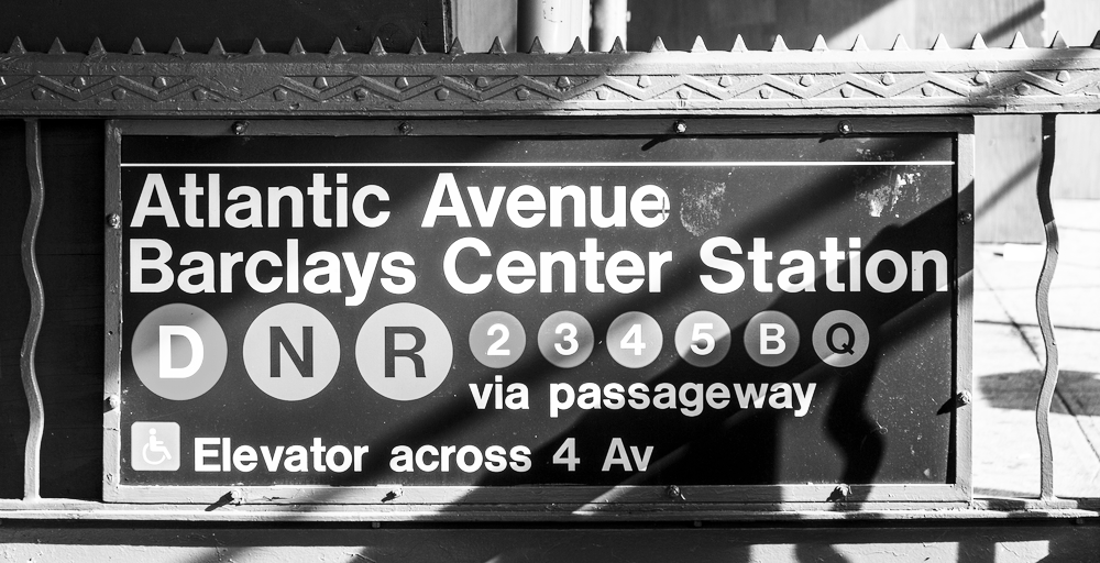
When seeking inspiration to design a set of product icons, we found it from an unlikely source – the New York City subway system. New York’s Subway is an essential part of the city. Serving as one of the world’s oldest and most extensive public transit systems, the subway’s 24 lines traverse Manhattan, Brooklyn, Queens, and the Bronx twenty-four hours a day.
To best help its passengers navigate through the concrete jungle, the city established a system of icons that is simple and easily understood by all. They accomplished this with the use of abbreviations housed in simple, token-like shapes. As a result, we’ve adopted a similar philosophy to identify each of the products that live within our repertoire.
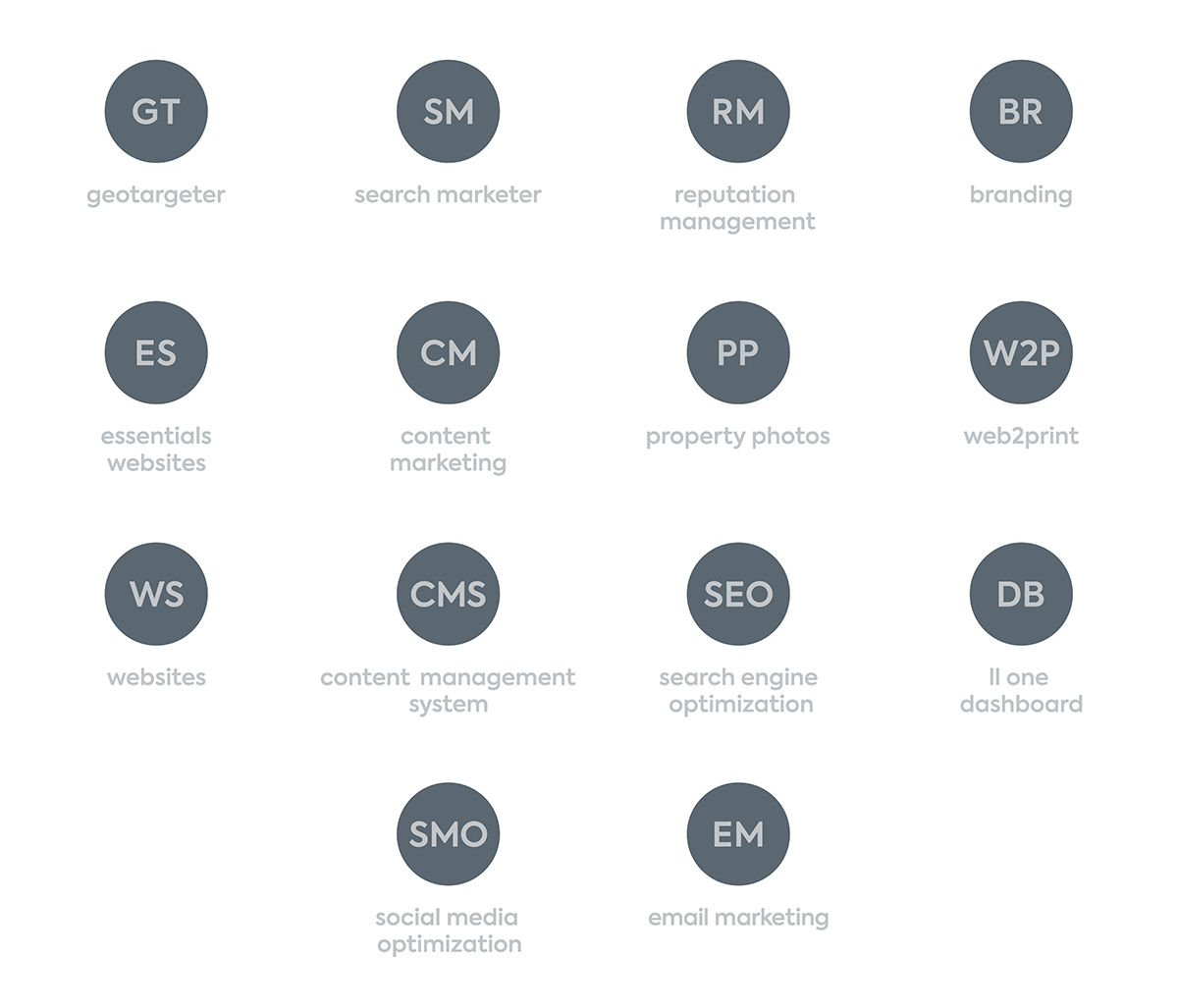
All of our products, from website design to branding to search engine optimization, will continue to elevate the standard for multifamily marketing, by harnessing the most innovative strategies and industry updates. Our team of marketers, creatives, and technologists have also gone platinum, and are eager to hone in on their crafts to deliver the leads that will transform your communities.
—
“LeaseLabs is a star. They’re innovative, forward focused and dedicated to exceptional client service. We couldn’t be prouder to call LeaseLabs a part of the RealPage family, and we will continue to support them in their efforts to provide new levels of innovation and service to their clients.”
ashley glover, chief operating officer, realpage, inc.
—
With a company culture that is stronger than ever and a customer community that makes us who we are, we cannot wait to embark on this next stage with you.
 A marketing package generated just for you. Interested?