12 UX design tips to enhance the property website experience for empty nesters and boomers

The COVID-19 pandemic has altered our lives and relationships for close to two years. One relationship in particular—our relationship with the internet—has experienced the greatest impact. It is most noticeable in the 65+ Baby Boomer/Empty Nester group, which, as of 2020, made up 16.9% of the total U.S. population. These seniors were the first to be shuttered indoors, where they were forced to escalate the learning curve in order to connect digitally, increase mobile literacy and rapidly accelerate their web usage (and overcome past aversion to it). Globally, this demographic group is growing more rapidly than any other, according to Toptal.
boomers’ internet usage
Twenty years ago, 86% of adults 65+ did not go online. Today, 73% do. And MarTech reports that 82% of Boomers use search enginesto find information on topics of their interest, including finding a new place to live. Other studies have revealed that the average 65+ adult spends approximately 27 hours per week online—quite a bit of time, considering that nearly 20% of American adults are retired by that age.
A Pew Research study has found that 53% of 65+ seniors are smartphone owners and that 34% of them frequent social media sites. A focus on UX design makes social sites appealing to the older demographic. For this reason, property website design teams should keep in mind increased mobile use among seniors coupled with their social media affinity.
website UX designs follow social media
As websites are being refreshed for an aging population in the COVID-19 world, gone are the days of text that is difficult to see clearly, an abundance of small buttons that are hard to select, loud colors, stock images, and content hidden behind confusing icons. Like social media sites, contemporary websites feature inclusive illustrations and clean, useful design with a foundation that still evidences editorial roots.
Here are 12 UX design tips to enhance the property website experience for empty nesters and boomers:
1. fast, visual representation
As more and more seniors are accessing the internet via mobile devices to acquire intel about communities in which they may want to live, information must be relayed with a focus on efficiency, clarity, and ease of use.
2. stickiness
Website designers need to study how social platforms achieve “stickiness” (anything that engages visitors and entices them to stay on the site longer than usual and return in the future).
Most of the copy on Facebook appears in an average 14-point size. The font for updates depends on the device (Roboto on Android; San Francisco on Mac), while the font for posts is currently Georgia (a serif font). These subtle contrasts coupled with columns, increased white space, and distinctive hierarchy significantly adds to Facebook’s stickiness. The social platform seems to be designed for Boomers—Facebook’s “least common denominator” and fastest-growing user population.
3. fun, user-friendly icons
Facebook, Twitter, and LinkedIn have replaced wordy explanations with icons while maintaining relatively monochromatic site structures.
4. appealing layout, color scheme, and fonts
Facebook, Twitter, and LinkedIn utilize a calming blue as their primary color and use minimal deviations in type and type size to indicate information hierarchy.
5. easy navigation
Research from a focus group has found that seniors are happiest when they can complete online tasks in three steps or less, according to a 2020 Wall Street Journal article. With that in mind, website navigation must be streamlined to make content more accessible for seniors to find.
For example, Ageist, a media platform founded in 2015 for those over 50, frequently updates its site to improve the user experience. It features easy navigation, with menu items displayed clearly at the top of the home page. And no more than a few scrolls brings the visitor to the bottom of the page.

6. design for physical changes in senior audiences
Ten million Americans have low vision or functional vision loss, and 60% are over the age of 55.
By age 65, some seniors can’t focus, have reduced field of vision, suffer reduced sensitivity to glare, and have difficulty resolving images, distinguishing colors, and adapting to changes in light. Cataracts and clouding reduce the amount of light that passes through the eye, and yellowing reduces violet light registered by the eye.
As seniors age, they lose some of their color perceptions—it’s harder to see blues, greens, and violets when those colors are used together on a site. Remember, Facebook, Twitter, and LinkedIn all use a singular shade of blue.
With that in mind, designers should ask themselves:
- Is the background attractive without interfering with the information?
- Are the colors easy to see and distinguish?
- Is the text a good color, size, and font?
- Is the home page clear, readable, and uncluttered?
- Are there clear focal points for the eye to follow?
Strive to balance type and negative space, as large open space areas and small blocks of text increase readability. Simplify nomenclature with user-friendly terminology and leave plenty of white space between sections.
Include hyperlinks with longer pages to allow “jumping” from section to section with one click. Use a wide margin to allow for variations in monitor size and resolution.
Additional content considerations include:
- Is information understandable and easy to find?
- Is the content benefit-oriented and relatable to a senior audience?
- Are instructions illustrated and understandable?
7. use engaging images to tell your story
Using larger images of people in everyday life, particularly in the context of your community, will strengthen your property website’s power to keep seniors engaged and interested in touring your community. Increasing the number and size of images on the site will add to its emotional appeal, and, therefore, to your property’s appeal.
8. create personalized experiences for seniors and boomers
Seniors rely heavily on social media to alleviate age-related isolation that the pandemic-induced, stay-at-home directive has exacerbated. Seniors have found that, through social media, communication is quick and effective, and communities can share interests and activities.
Property owners and managers can take advantage of social media’s sharing power by giving seniors a reason to post positive comments about their communities and share photos and other content. The eWOM generated will enable communities to acquire more qualified leads and increase demand for their rental properties.
9. enable virtual tours
Another “must” for delivering a personalized experience on your community’s website is to offer virtual tours of the property. Enabling seniors to safely experience virtual property viewings can lead to increased conversions.
10. heighten user experience with interaction
Interaction is fundamental to the user experience. Visual cues are often vital to those interactions. Seniors need clear visual cues that are easy to decipher and connect with. Moreover, every part of the interaction must be easy to understand and complete.
11. demonstrate trustworthiness and credibility
The pandemic has ushered in a “trust crisis,” especially among seniors, who are particularly vulnerable to scams. As a result, website content must demonstrate trustworthiness and credibility.
- Make it clear who you are and why they should trust you.
- Increase credibility with high-quality graphics, good writing, and the use of outbound hypertext links. This signals to seniors that you have done your homework and are not afraid to refer readers to those linked sites.
- The “Home” and “About Us” page copy should reflect empathy for visitors’ needs and showcase your community as their best living option.
- Make privacy and security settings easy to manage.
- Be transparent about how the information will be used.
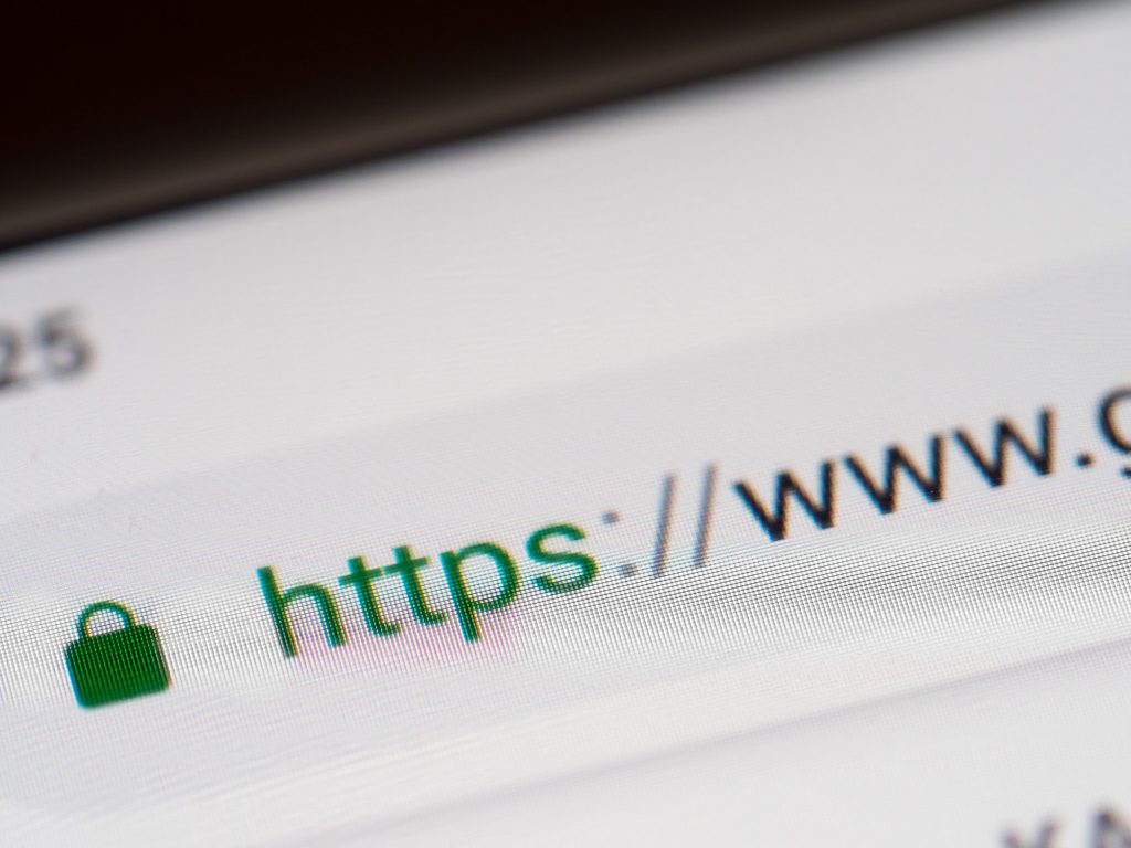
12. ensure website security
Communities would be wise to ensure the security of their property websites with, at the very least, SSL. Website URLs that begin with “https” signal seniors that the website is safe and that their computer or phone will not become infected with malware due to their site visit.
![]() Our Websites are creatively and digitally engineered to deliver. Interested?
Our Websites are creatively and digitally engineered to deliver. Interested?