3 UX design trends that are taking over multifamily websites in 2021

Content is abundant nowadays as we have shifted from print material to online interfaces when accessing information. As more and more websites are created, your competition expands as everyone can now have a substantial online presence. Websites can act as your game plan in coming out on top of your competition, and there are key areas within digital interface design that are critical to pay attention to, and one of those is UX design trends.
What is UX design, you ask? UX design translates to a user’s experience when interacting with a digital interface on any given device, whether it be a mobile phone, an apple watch, or even your favorite app on your smart TV. Every design functionality acts as a guide on how a user behaves. So UX refers to the experience of their journey when they interact on these devices. Within web design, there are three key UX trends to look out for when accessing property websites as we continue into 2021:
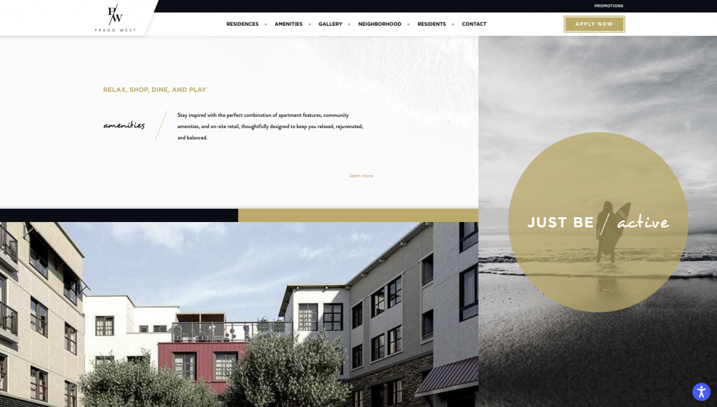
1. asymmetrical layouts
The arrangement of an interface layout is a crucial component when a designer is laying out design embellishments to formulate a distinct vision. As basic as it may sound, the placement of these embellishments is a formula on how a viewer can feel captivated and how they engage with the interface.
Within multiple industries such as the multifamily housing industry, architecture, and real estate, there has always been a common norm where symmetrical methodologies are the standard for design and offer a balanced approach. But it is often perceived that asymmetrical layouts are not balanced, which is untrue. As we find ourselves problem solving for various clients located all over the map, each property and persona has vast differences in demographics, terrain, topography, and history. Nature has a funny way of reminding us that asymmetry exists everywhere, whether it be uneven mountaintops, uneven sea shelves, or the simple number of petals on a flower. So, when a designer starts to implement their vision in a new website experience, and they use an asymmetric approach, the layout will often follow classicism, advanced recognition, the hierarchy of information, and the ability to move away from traditionalism. As a new property becomes the town’s talk in any new market, asymmetrical layouts allow users to form trust within the user experience while allowing for more boundless and provoking modern designs to gain traction.
Example of Asymmetrical layout: Prado West
2. motion
Web experiences set the tone of explaining a brand story and incorporate a flow of information that leads the user down an interaction path. People of all backgrounds and ages universally gravitate towards motion that offers little hooks of engagement, so any user has the capability of feeling gratified, whether they are submitting rent online via a residents’ portal or simply scrolling through a Netflix library of movies on a laptop. Motion carries weight into how people rapidly process information, especially in 2021.
Animations can certainly aid the experience; however, it should be noted that animations should only be incorporated if they serve a purpose. Animations should always simplify and clarify how users absorb information, so if there are micro-interactions that do not abide by that general rule of thumb, you’re going to leave the users feeling confused, and as a result, they will immediately navigate away from your website.
Example: Conrex using micro-interactions to effectively communicate the 3-step process by using subtle fades.
Micro-interactions generally relieve tension for a user, and since users’ attention spans have decreased, they are subtle ways to keep the user engaged while abiding by usability standards.
3. dark mode
Let’s face it, looking at screens for an extended period can create strain and fatigue on the eyes. But let’s also consider that when people start looking for a new apartment, they tend to conduct most of their apartment searches after work, leading into the evening hours. So viewing a website in dark mode, especially at night, offers a more relaxed viewing experience. Additionally, more and more communities want to stand out and become that modern property in their neighborhood. A darker aesthetic can help achieve this.
Additional benefits to switching to a darker canvas include:
• Easily legible on the eyes in darker environments, especially at night
• Decreases eye strain
• Allows for important info to stand out
Example: Cirque Dallas
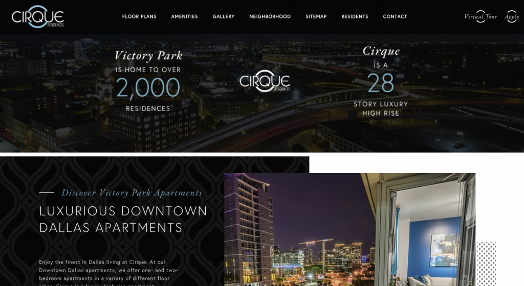
As we saw a rise in darker interfaces in 2020, this trend will continue to be prevalent throughout 2021.
conclusion
Now that we have discussed these three trends, it is essential to know when to use these practices and why. Again, each trend must have some basis and well-thought-out reasoning when being used. Generally speaking, if these trends offer ways to enhance understanding, amplify experiences, and direct attention to vital information, then they will act as excellent references for your upcoming website.
![]() Our Websites are creatively and digitally engineered to deliver. Interested?
Our Websites are creatively and digitally engineered to deliver. Interested?